GLOBAL RELEASE—The Pantone Color Institute has just officially unveiled 2022’s Color of the Year, PANTONE® 17-3938 Very Peri, described as a “dynamic periwinkle blue hue with a vivifying violet red undertone that blends the faithfulness and constancy of blue with the energy and excitement of red.”
The latest pick from the institute also marks as a first in the storied 22-year history of the color authority to create a new hue that forecasts the values and trends of the coming year. PANTONE 17-3938 Very Peri, for the institute, serves as “the happiest and warmest of all the blue hues, that introduces an empowering mix of newness.”
“The Pantone Color of the Year reflects what is taking place in our global culture, expressing what people are looking for that color can hope to answer,” declared Laurie Pressman, Vice President of the Pantone Color Institute.
“Creating a new color for the first time in the history of our Pantone Color of the Year educational color program reflects the global innovation and transformation taking place. As society continues to recognize color as a critical form of communication, and a way to express and affect ideas and emotions and engage and connect, the complexity of this new red violet infused blue hue highlights the expansive possibilities that lay before us.”
Pantone Color Institute is the business unit within Pantone that champions top seasonal runway colors to forecast global color trends, empowering companies across industries on color for product and brand visual identity. The institute then partners with global brands to effectively leverage the power, psychology, and emotion of color in their overall design strategy.
In its announcement, Pantone shared, “We are living in transformative times. As we emerge from an intense period of isolation, our notions and standards are changing. Displaying a carefree confidence and a daring curiosity that animates our creative spirit, inquisitive and intriguing, PANTONE® 17-3938 Very Peri helps us to embrace this altered landscape of possibilities, opening us up to a new vision as we re-write our lives. Rekindling gratitude for some of the qualities that blue represents complemented by a new perspective that resonates today, PANTONE® 17-3938 Very Peri places the future ahead in a new light.”
Leatrice Eiseman, executive director of the Pantone Color Institute, highlighted, “As we move into a world of unprecedented change, the selection of PANTONE® 17-3938 Very Peri brings a novel perspective and vision of the trusted and beloved blue color family, encompassing the qualities of the blues, yet at the same time possessing a violet-red undertone, PANTONE® 17-3938 Very Peri displays a spritely, joyous attitude and dynamic presence that encourages courageous creativity and imaginative expressions.”
Further, Eiseman tells TIME, “It’s unusual to refer to blue as ‘happy,’ but when you add that red element to it, that’s exactly what happened. We felt it was so important to put together a color that encapsulated the feeling of newness.”
In 2020, in the midst of the pandemic, Pantone introduced two colors, Ultimate Gray and Illuminating, portraying strength and resilience in the face of adversity, while embodying hope looking into the future.
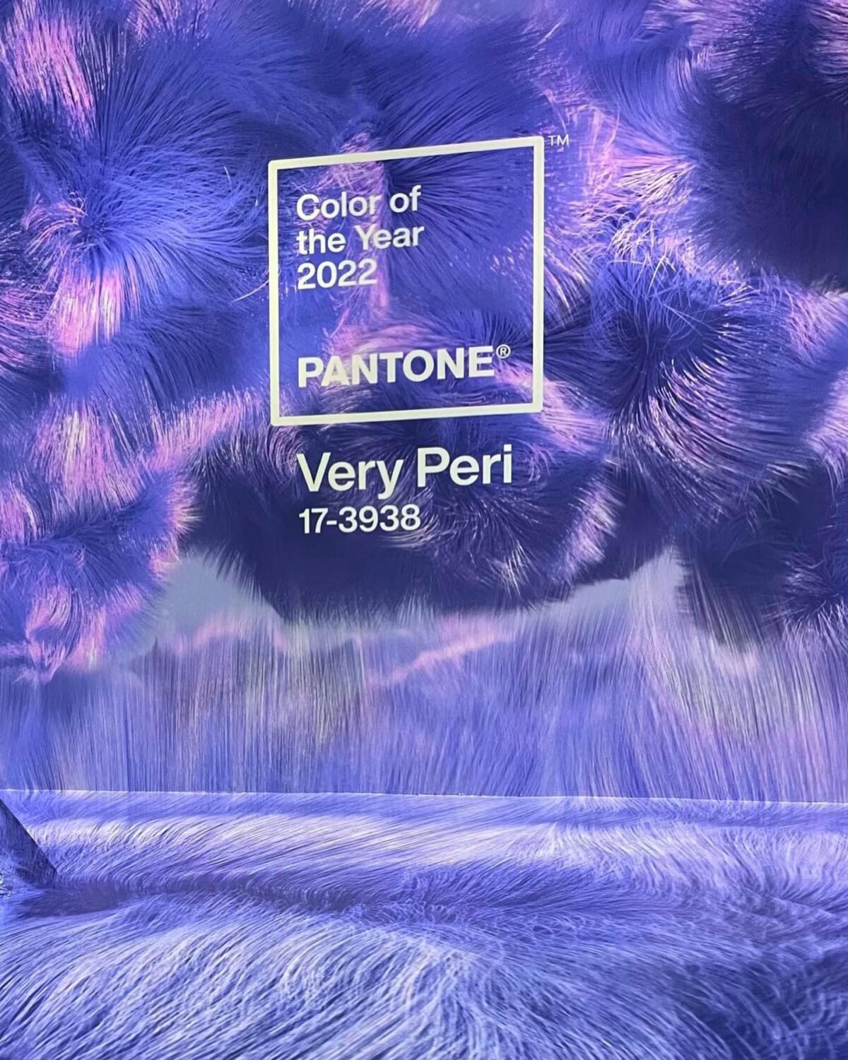

Very Peri Installation at ARTECHOUSE NYC. Images via Pantone FB.
With this announcement, Pantone has also partnered with ARTECHOUSE NYC to weave a visually and audibly compelling digital experience that fully incorporates rich textures and images of the Color of the Year to a 21st century audience. Following this unveiling, ARTECHOUSE is looking to further immerse a bigger audience with an exhibition to the public in 2022.


